Earth
ID: 10831
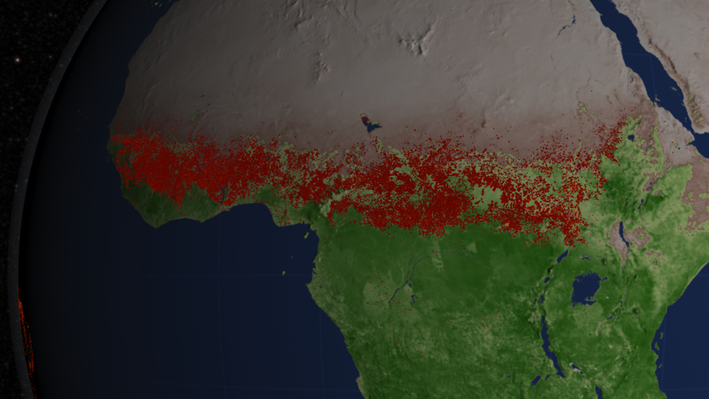
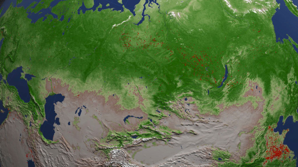
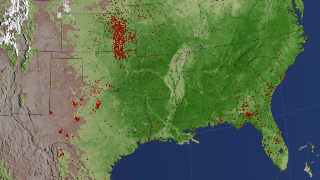
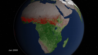
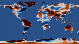
What do nearly ten years of satellite fire observations look like? Instruments on two NASA Earth-observing satellites have answered that question by scanning the surface for signs of fire four times a day since 2002. The instruments have generated an ever-growing string of data that researchers have used to map the distribution of the world's fires in unprecedented detail. The visualization below provides a global tour of these observations using red to indicate actively burning fires, green to show vegetation and white to show snow. It begins with heavy grassland fires that speckle the dry interior of Australia in 2002. The view then pans to Asia and fire-prone Africa where waves of agricultural and management fires sweep across large portions of these continents in sync with seasonal surges of vegetation and retreating snow. A glimpse of a mild South American fire season in 2009 follows, along with intermittent flashes from wildfires that ravaged areas of Texas in the spring of 2011. Such data has more than aesthetic value: scientists use it to track fire trends over time and to refine calculations that show how greenhouse gases and particles emitted by fires in different regions contribute to climate change.


The Geography Of Fire
Related Story
Story Credits
Lead Visualizer/Animator:
Lori Perkins (NASA/GSFC)
Video Editor:
Kayvon Sharghi (USRA)
Interviewees:
Chris Justice (University of Maryland)
Amber Soja (NASA/LaRC)
Jim Randerson (University of California, Irvine)
Narrator:
Jefferson Beck (USRA)
Producer:
Kayvon Sharghi (USRA)
Lead Scientists:
Chris Justice (University of Maryland)
Louis Giglio (SSAI)
Luigi Boschetti Ph.D. (University Of Maryland College Park)
Videographer:
Rob Andreoli (Advocates in Manpower Management, Inc.)
Lead Writer:
Adam P Voiland (Wyle Information Systems)
Please give credit for this item to:
NASA's Goddard Space Flight Center
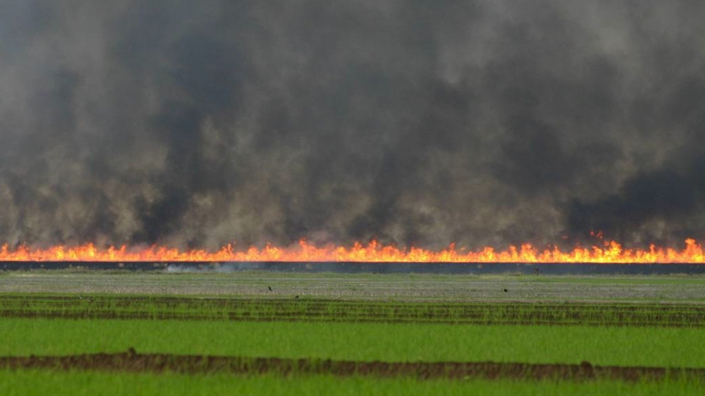
Photograph of burning fields courstery of Research Scientist Jessica McCarty (Michigan Tech Research Instistute).
NASA's Goddard Space Flight Center
Photograph of burning fields courstery of Research Scientist Jessica McCarty (Michigan Tech Research Instistute).
Short URL to share this page:
https://svs.gsfc.nasa.gov/10831
Keywords:
SVS >> Fire Management
GCMD >> Earth Science >> Atmosphere >> Air Quality
GCMD >> Earth Science >> Human Dimensions >> Natural Hazards >> Fires
DLESE >> Narrated
SVS >> Biosphere >> Ecological Dynamics >> Fire Occurrence
SVS >> App
NASA Science >> Earth
GCMD keywords can be found on the Internet with the following citation: Olsen, L.M., G. Major, K. Shein, J. Scialdone, S. Ritz, T. Stevens, M. Morahan, A. Aleman, R. Vogel, S. Leicester, H. Weir, M. Meaux, S. Grebas, C.Solomon, M. Holland, T. Northcutt, R. A. Restrepo, R. Bilodeau, 2013. NASA/Global Change Master Directory (GCMD) Earth Science Keywords. Version 8.0.0.0.0
