February 2004 - (date of web publication)
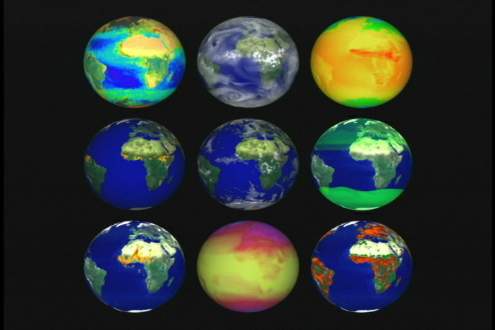
The Earth comprises a single system made up of many interacting subsystems. These images provide a look at many of these subsystems and our planet itself, based on satellite data from recent years.
To order this video, G03-046 Many Faces of Earth, please click here: https://www.nasa.gov/centers/goddard/multimedia/how_to_order_tapes.html
Blue Marble
Recalling the famous Apollo-era pictures of Earth taken by lunar astronauts, this digital image was created using data from three Earth-observing satellite instruments. The research team's goal was to assemble an image that recreates the visceral impact of viewing Earth from space with human eyes.This depiction features Hurricane Linda off the west coast of North America, sediments around the mouth of the Amazon River and the shallow waters of the Caribbean. Heavy vegetation is green, while sparse vegetation is yellow. Mountain heights and valley depths exaggerated 50 times to depict vertical relief. Data from GOES and SeaWiFS, based on Apollo 17 photo. The Greatest Earth on Show
In the thirty years since Apollo 17, we have continuously increased our ability to see the planet in greater detail. The most detailed image of the entire Earth to date is the new "Blue Marble" image, created in 2002. To form the Blue Marble, NASA scientists and visualizers stitched months of satellite observations of the land surface, oceans, sea ice and clouds into a seamless, true-color mosaic of every square kilometer (.386 square miles) of our planet. The following sequence showcases the spectacular Blue Marble. Data from Terra/MODIS.
Earth at Night
U.S. Defense Meteorological Satellites measure the brightness of nighttime lights on the Earth. NASA researchers used these images of nighttime lights to determine where urbanization was most likely to effect weather records. Weather stations were classified as urban, near-urban or rural depending on the brightness around them and their records adjusted to account for human influence. This is a composite of many days' images. In the second image, red shows fires.
Pulse of the Planet - Rebound from El Nino
The bloom associated with the 1997 to 1998 El Nino to La Nina transition event splashed across the Pacific Ocean like pigment thrown across empty canvas. Jetting from west to east for about 10,000 km, the explosive, yet short-lived growth spurt coincided with significant rising of cold, nutrient-rich waters brought about by La Nina. During the powerful 1997 El Nino event, SeaWiFS recorded little or no significant growth of phytoplankton in the equatorial Pacific.
Changing Seasons, Take One
By monitoring the color of reflected light via satellite, scientists determine plant photosynthesis, essentially a measurement of successful growth, meaning use of carbon. Before SeaWiFS, scientists only had a continuous record of photosynthesis on land. Through three years of data collection from space, NASA gathered the first record of photosynthesis in the oceans. With this record, experts map trends and anomalies in the global circulation of carbon. Here, data is seasonally averaged, showing: (N. Hemisphere) fall, winter, spring, summer, fall, winter, spring.
Changing Seasons, Take Two
These animations show several years of seasonal growth and recession, Normalized Difference Vegetation Index (NDVI) data, a method for measuring how plants absorb or reflect sunlight. Although there are distinct and strong oscillating signals corresponding to the change of seasons, each year shows unique features as plants grow and die off. Some of these features show distinct signs of drought. These NDVI data come from NOAA's Advanced Very High Resolution Radiometer (AVHRR) on the Polar Orbiting Environmental Satellite (POES).
a) North America NDVI average for each month, July 1981-July 2000
b) Africa NDVI average for each month, July 1981-July 2000
c) North America 20-year NDVI average (1981-2000), by month
(Jan- Dec)
d) Africa 20-year NDVI average (1981-2000), by month (Jan
- Dec)
e) Global NDVI average, March 2000
Drought
By taking the monthly NDVI average of a particular region of the Earth for the years 1981-2000 and subtracting the NDVI value of that same region during a specific month, the result indicates relative wetness or drought. In the following images, the first picture in each group shows the NDVI 20-year average. The second image shows the specific month's measurement. The final image in each sequence shows the difference, the quantified anomaly. In the anomaly images, browns indicate drought conditions as compared to the average, while greens indicate plant growth greater than average.
Grasslands of the World
Rotating globe showing global grassland coverage. Data obtained from Terra/MODIS landcover isolating grasslands, woody savannas, savannas, and wetlands (all seen in green). These data represent four parts of a 17-part global classification product, all of which have been taken at 1-kilometer resolution.
Global Land Cover
This animation shows global land cover types in different colors, based on Terra's MODerate-resolution Imaging Spectroradiometer (MODIS) data. Forests are shown in shades of green. Less dense vegetation is in shades of yellow and orange. Permanent snow and ice are white. Wetlands are bright blue, and non-ocean water is pale blue. Urban areas are red. Barren and sparsely vegetated areas are gray.
Snow Cover
MODIS maps of snow-covered areas show that snow was late to arrive and early to recede in many parts of the country in 2001 - 2002. Data are time-series of snow cover derived from 8-day composite snow maps from a) Dec. 2001 - Feb. 2002, and b) Dec. 2002 - Feb. 2003
Changing Seasons, Changing Ice
This visualization of data from Defense Meterological Satellite Program (DMSP) Special Sensor Microwave Imager (SSMI) and Terra's MODerate Resolution Imaging Spectroradiometer (MODIS) shows ten years of polar sea ice variation. Data begins Jan.1, 1990 and extends through Dec. 31, 1999, showing variability throughout the year and from year-to-year for the North and South Pole.
Sea Surface Temperatures
This sequence shows a year in the life of global and Atlantic ocean temperatures, June 2, 2002 to May 11, 2003. Green indicates the coolest water, yellow the warmest. The Advanced Microwave Scanning Radiometer (AMSR-E) on the Aqua satellite saw through the clouds to provide sea surface temperatures.
Carbon Monoxide
A rotating globe showing the propagation of Carbon Monoxide (CO) across the earth as measured by the Measurements of Pollution in the Troposphere (MOPITT) instrument aboard the Terra satellite. By studying where these atmospheric gases concentrate, how they circulate through the atmosphere, and how they form, scientists gain a more complete picture about how atmosphere pollution interacts with and affects our environment. Red indicates highest CO concentrations. Data from March - December 2000.
Ozone
2002's unusual reduction in ozone losses proved just that - unusual. The ozone 'hole,' actually an annual thinning of the protective ozone layer, grew larger throughout the late 1980's and early 1990's, as shown in this series of maximum areas from 1979 to 2003 (excluding 1995). In 2003 the hole reached nearly the same size as 2000 and 2001, larger than the North American continent. While the manufacture and use of chlorofluoro- carbons that contribute to yearly ozone destruction have decreased, the chemicals linger in the upper atmosphere for decades before the layer will consistently recover. Data from Total Ozone Mapping Spectrometer aboard Nimbus-7, Meteor-3 and Earth Probe satellites.
Ground-Level UV Exposed
With decreased ozone levels come elevated levels of ultraviolet exposure, radiation that can reach ground level. TOMS tracks UV-B radiation measured at 290-320 wavelengths. The most dangerous form, it can cause everything from sunburns to skin cancer to cataracts. Worldwide and US measurements of UV-B levels at ground level, called the erythemal index, are shown for the year Aug. 2000 - July 2001.
Tectonic Plates, Earthquakes, Volcanoes
The Earth's several layers have very different physical and chemical properties. The outer layer, which averages about 30 miles in thickness, consists of about a dozen large, irregularly shaped plates that slide over, under and past each other on top of the partly molten inner layer. Most earthquakes occur at the boundaries where the plates meet. In fact, the locations of earthquakes and the kinds of ruptures they produce help scientists define the plate boundaries. Plate boundaries are in blue, earthquakes that occurred 1960-1995 along the plates are in yellow, and 1960-1995 volcanoes are red.
Under the Oceans - Bathymetry
Just as land above sea level has different elevations, which we call topography, land below sea level has different depths, called bathymetry. Together, they're called relief. These visualizations illustrate bathymetry of the world's oceans: we see the Pacific Ocean drainand the bathymetry of the whole planet.
Fiery Planet - A Year of Global Fire
This visualization shows a global picture of fires, scintillating the Earth's surface like pinpricks of light. The individual fire pixels themselves transition through a range of color, indicating duration and intensity as measured by the MODIS instrument on-orbit. These fires occurred between July 2001 and August 2002.
Other Earth Views
- Feb. 2000 Lunar Eclipse (GOES data, courtesy NOAA)
- Earth Limb with sunset
- Earth Limb Blue Marble MODIS data
- Earth Limb Blue Marble MODIS data with clouds
- Zoom out with auroras to Sun
Great Zooms - United States
Alaska
Atlanta, GA
Baltimore, MD
Boston, MA
Chicago, IL
Los Angeles, CA
New Orleans, LA
New York, NY
Park City, UT
San Francisco, CA
Seattle, WA
Tucson, AZ
Washington, DC
Great Zooms - Global
Amazon, Brazil
Mongu, Africa
Sabie River, Africa
Landsat U.S. Cities
Baltimore, MD/Washington, DC
Boston, MA
Chicago, IL
Dallas/Ft. Worth, TX
Los Angeles, CA
New York, NY
San Francisco, CA
Seattle, WA
SeaWiFS U.S. Cities
Scientists have produced a series of high-resolution images using SeaWiFS data to help them better understand seasonal changes in ocean and land-based plant life in regions around the U.S. Each sequence begins with true color images from selected dates and transitions to computer-enhanced images which highlight plankton and sediment concentrations. The images focus on seventeen coastal regions around the U.S., including:
Boston and Cape Cod
Buffalo and Great Lakes
Chesapeake Bay and Eastern Shore
Chicago and Great Lakes
Detroit and Great Lakes
Cape Hatteras and Outer Banks region
Miami region
New Orleans and Gulf Coast
Seattle/Vancouver
Tampa, FL
Landsat Tours of Great Spaces
Crater Lake
Death Valley
Florida Everglades
Glacier Bay
Glacier Park
Grand Canyon
Mt. Rainier
Mt. St. Helens Volcano
Pacific Northwest Traverse, including Cascade
Mountains and Seattle
Yosemite National Park
For more information contact:
Wade Sisler
Goddard Space Flight Center
Greenbelt, MD
Phone: 301-286-6256
Producer: Kathryn Stofer
Caption for Item 1:
A few of these subsystems are pictured in
these datasets (left to right, top to bottom):
- biosphere (SeaStar/ SeaWiFS Courtesy Orbimage*)
- water vapor (GOES 9 & 10 courtesy NOAA, Meteosat, and GMS-5)
- temperature (Globe)
- fires (AVHRR)
- clouds (GOES 9 & 10, Meteosat, and GMS-5)
- methane (UARS)
- aerosols (TOMS)
- radiant energy (Globe)
- vegetation index anomalies (NDVI).
Note that the datasets are not
synchronized in time.
For previews of these animations, please visit this web site
**Please note: not all animations appearing on this web site appear on the videotape exactly as previewed on the web.
* NOTE: All SeaWiFS images and data presented on this web site are for research and educational use only. All commercial use of SeaWiFS data must be coordinated with GeoEye (Orbimage became GeoEye and then In January 2013, DigitalGlobe and GeoEye combined to become one DigitalGlobe.).